Work Scope
・Corporate logo design
・Product brand logo design
・Visual identity development including color strategies
・Design guideline
Project
Corporate design(2012)
Background
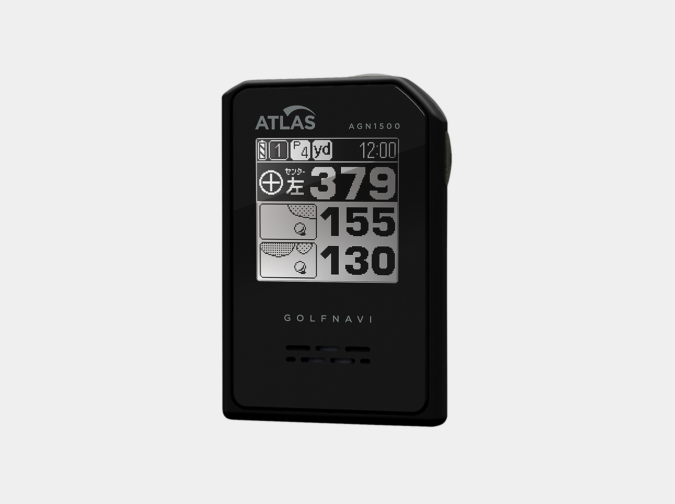
Yupiteru is a company that provides sophisticated products specialized in high frequency radio communication operation. In sports scene like cycling or driving, YUPITERU expanded product lines in IT services dealing with navigation system, drive recorders and GPS Logs.
In order to stimulate its business expansion, the company started up a project to renew the corporate logo. RISKYBRAND was selected as their partner.
Process
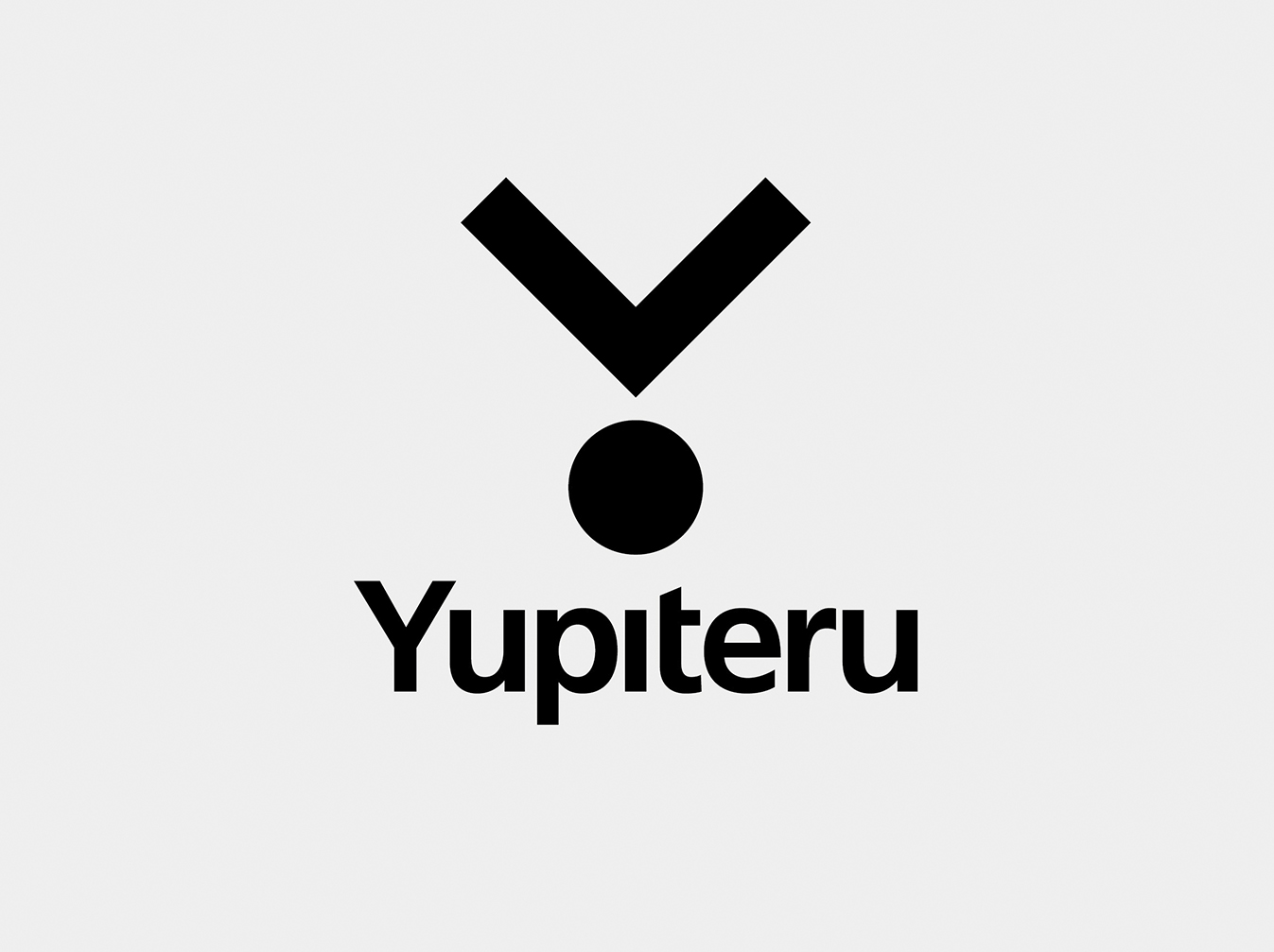
The challenge was how to add a valuable symbolism and literal sense in its 8 alphabetic letters of “YUPITERU”. After studying, a combination of majuscule and miniscule of each alphabet was selected to make a new typeface of the logo.

The new corporate logo for YUPITERU was created based on a key words expressing “To the point”. The form that associates the reach point by the navigation and its silhouette was thought that could recollect YUPITERU’s “Y”.


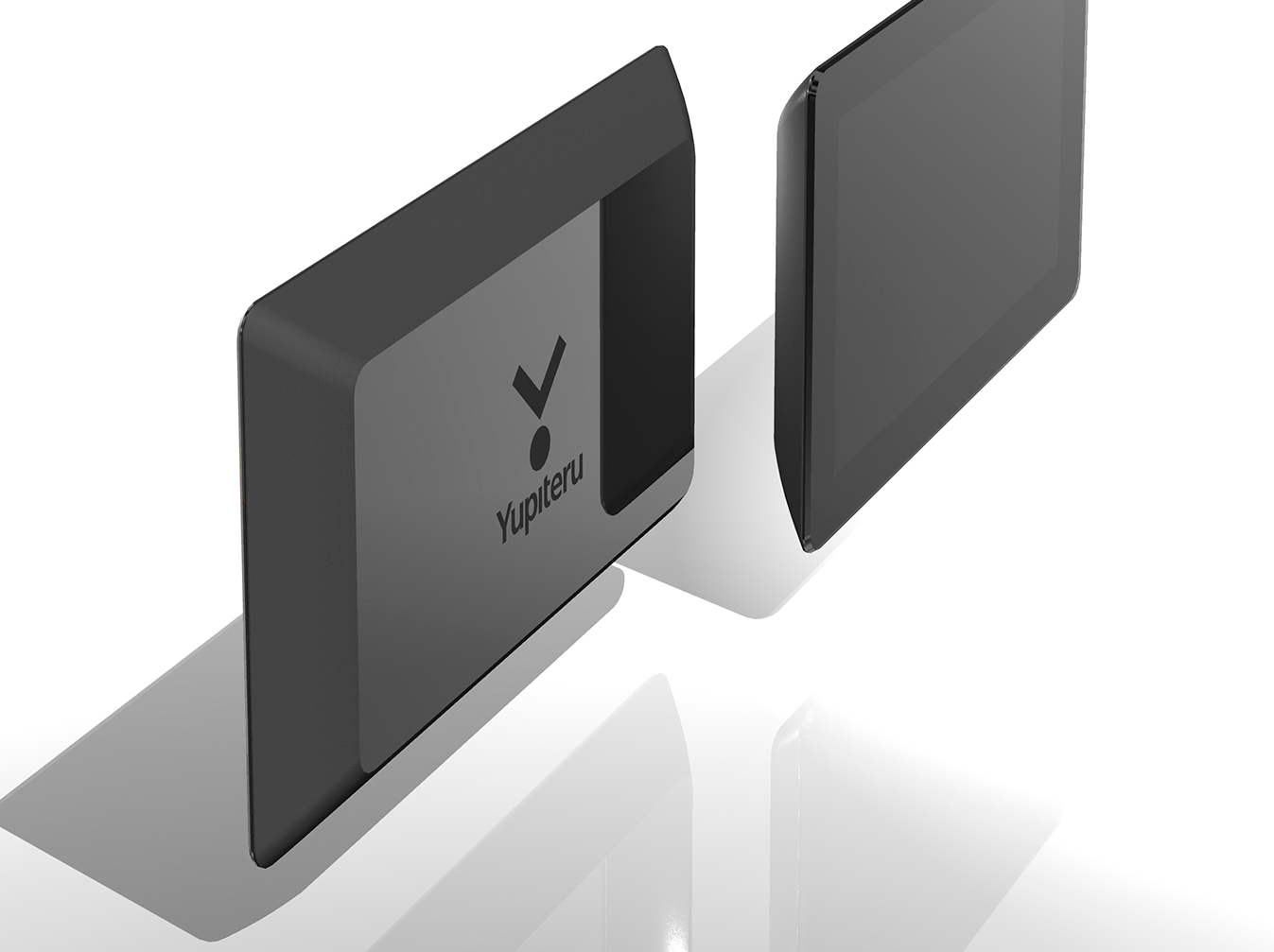
RISKYBRAND supported the development in the visual identity including each communication items and also corporate logo and design lineups.
Result
The new YUTERU logo was released in 2013. YUPITERU is keeping playing an active part in the market under this brand new corporate logo, keeping producing high quality equipment.
| Client | Yupiteru Corporation |